
How to colour an artwork
Colour is one of those subjects that I avoided for a long time because it was
scary and seemed complicated.
It's not that complicated. With a little playing around you can get the hang of it.
I like to split it into 3 stages.
Colour is one of those subjects that I avoided for a long time because it was
scary and seemed complicated.
It's not that complicated. With a little playing around you can get the hang of it.
I like to split it into 3 stages.
Stage 1 - Define your values.
Select 5 different shades of black ranging from darkest to lightest
Create a black-and-white version of your desired colour palette.
Think of how you want the viewer to read the image & use your values
to achieve this. What elements do you want to emphasize? What elements
do you want to understate? Your values are a tool to help you share
your vision.

Stage 2 - What kind of colour harmony do you want?
Different colours convey different moods and even messages. You could ask yourself.
What mood are you trying to convey?
Do certain colours have a specific symbolism for your audience?
Do you want to be loud and colourful? or is it more appropriate to be understated and analogous?
The best colour palette is the one that communicates your vision in the most authentic way.
Stage 3 - Colour palette exploration.
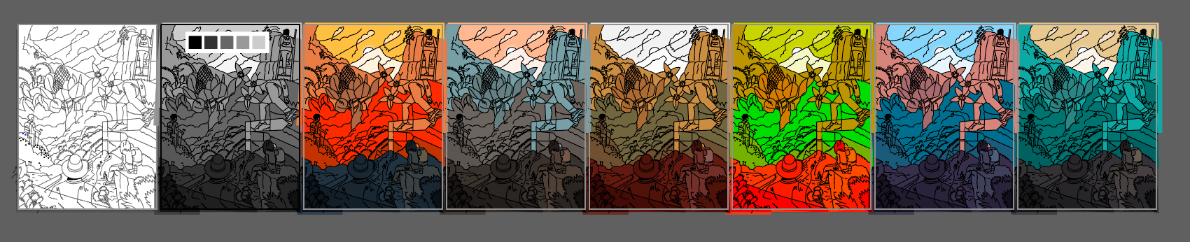
This is where we see the value of stage 1. We will take our values and transform them into final colour palettes.
For this like to use colour palette generators like.
Coloors
Adobe Colour
For this like to use colour palette generators like.
Coloors
Adobe Colour
Additional resources
- Interaction of colour By Josef Albers
- Color.Nerd
- Understanding Color
- How to see in Value
- Interaction of colour By Josef Albers
- Color.Nerd
- Understanding Color
- How to see in Value